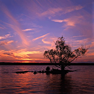
I do have to agree that, intended or not, the sun becomes a central subject in the seascape photos. Given that, I'd move to one of those magic points in the frame as given us by the rule of thirds.
Now ... having been agreeable, I'll be somewhat argumentative.
jwind said:
... I find squarish crops rarely work well with vast landscapes. After all, generally landscape is shot with wide angle lenses, it would be counter productive to then go and crop your angle of view.
First, jwind, I find your statement enigmatic, in that both of the (very nice, BTW) photos you posted to make your points in your first post in this thread, are square or nearly square in shape.
Second, having for a number of years shot with medium format, square image reflex cameras, I am of the opinion that perfectly nice landscape compositions do come in that shape. It's all about how the photographer positions himself and arranges subject elements within the frame. And some landscapes (and other subjects) just present themselves as natural squares.
Third, I really disagree with the comment about lanscapes generally being shot with wide angle lenses. It may be that photoghraphers reach first for their wide angle lenses when confronted by a landscape, and that some photogs never do otherwise. But that also may explain why so many unexceptional or outright disappointing landscape photos are made. Many fine landscapes are done with normal and normal-plus focal length lenses, which yield picture images that match what our eye-with-brain "sees" in edited version.
Prudence dictates extraordinary care in making blanket statements or rules about these things.
G.

")