Faux sunset colors.

vftt.org

Help Support vftt.org:

This site may earn a commission from merchant affiliate links, including eBay, Amazon, and others.

NewHampshire

New member
Joined
Apr 14, 2005
Messages
1,554
Reaction score
311
Location
Goffstown NH, Avatar:Sending out praise for the Re
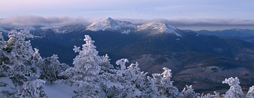
When we summited Carter Dome yesterday the daylight was late day. This gave me some nice shadows to play with, and when I got home I started toying around with the photo filters in Photoshop to try and reproduce some Faux sunset coloring. I have used the warming filter with interesting results, but decided to try and push things a bit further. I am curious to see what others think of the results......

first up:
presiscopyzm1.jpg

This is using a Magenta filter set to 30%

presiscopy2qj5.jpg

This is the same setting with the magenta filter, but with the addition of the Warming filter set to 20% stacked on top.

For comparison sake this is the un processed origional (pre cropping, lighting and levels adjustment):
img0224copypt4.jpg


So, what are your thoughts? Is it an interesting concept to try once and a while, or does it just look too overdone and unnatural?

Brian
 
Last edited:
I like the first one best. It looks more natural. The secound one looks a bit overdone. On a side note you might want to try cropping a bit more sky out of the scene. The ridgeline of the Presies is a bit to close to the center of the frame for my liking. Overall the photo certainly catches a great mood.
 
First off, I agree with the suggestion about cropping some of the sky. I’d say the top of the frame should show just a smidgen -- and no more -- of that bright spot in the sky.

Magenta certainly seems to have been a good choice of filter color for your experiment. In the end – after some real noodling – I decided to prefer the first filtered version. It has a more natural and believable look that delivers some nice tones in the shaded foreground to convey the sense of winter chill. The second just takes it too far for my taste. (I’ll come back to this and look again, and could change my mind – this was a fairly difficult choice for me.)

G.
 
Thanks for the crop suggestions. I have toyed around a bit, so how does this suit you:

presiscopyalternatecroptz7.jpg


This was actually a bit tough. Do I sacrafice some interesting cloud features to the left, or distant peaks in the background to add a bit more scale......and in the end I cut out a smidge of the left saide. I thought all the features create a hot focal point on the upper left side area that sort of "flows" out to the lower right. But I may be biased, so am interested to hear if this works better for you folks or not.

Brian
 
The sky makes a nice backdrop but does not contain much – if anything – in the way of “content” that really engages the eye. Thus it can be cropped fairly ruthlessly without much negative consequence. The main thing is to find a horizontal crop that produces visual balance as suggested by the Rule of Thirds.

Cropping on the left raises another issue. Here, the gathering clouds above the distant ridgeline relate nicely with the bank of clouds that forms the principal horizon across the scene. They help frame the entire vista. While I do like what cropping on the left does with the foreground, I think it so reduces the importance of the gathering clouds and ridgeline at the left that the picture seems uncomfortably free of interesting content on the right – unbalanced. That makes me want to trim from the right, too.

In the end, I think I’d leave the left-right cropping alone, to conserve as much of the original image (think pixels!) as possible.

G.

(P.S. -- You know, this kind of stuff actually gets discussed sometimes when my newspaper colleagues and I are doing the final selections and edits on our photos for publication: "Hey, Joe, what do you think makes the best crop here?" Often enough there are obviously "right" and "wrong" cropping choices, but at the end the "best" crop is a fairly subtle bit of business. That's part of what makes the fun -- it pushes us to make sometimes difficult choices under deadline pressure, and we go home wondering what it really will look like in print tomorrow morning.)

Happy New Year!
 
If you're going to crop from the left, I'd want to crop a similar amount off the right to put the mountains back in center. You also have a bit of mostly-empty plain white snow across the bottom you could crop off (losing one more snow-covered small spruce is inconsequential.) I played with it only by resizing the browser window to fake the cropping action...

Tim
 
bikehikeskifish said:
... I played with it only by resizing the browser window to fake the cropping action...

That's the way I do it, too! Q&D, but effective.

G.
 
a little play...

I like what you're trying to do and have been playing around a bit with your photo. Is this too much? I removed the color cast first, then used a deep red photo filter on a copied layer. I then added a hide-all mask and painted away the sky and mountains first, then some of the valley to add red to that area, leaving the snow in the foreground alone.


Kevin (I love playing with photoshop!)
 
Its interesting Kevin, but I think its a tad overdone. Perhpas lightening up the pink a bit. My origional idea was to give a hint of "fake" coloring, which is why I think Grumpy was a bit put-off by the slightly overdone second version in the origional post.

Brian <----who needs to get a "real" copy of Photoshop some day (and not just Elements 5 :D :rolleyes: )
 
NewHampshire said:
Its interesting Kevin, but I think its a tad overdone. Perhpas lightening up the pink a bit. My origional idea was to give a hint of "fake" coloring, which is why I think Grumpy was a bit put-off by the slightly overdone second version in the origional post.

That's the nice thing about this technique. By removing the mask a little at a time I can make it as dark or light as I want. I can even go back over spots and add masking if I overdo it.


Kevin
 
I'm a terrible photographer....and know NOTHING about photoshop.....but I am a landscape painter and color is something I am always interested in. It seems to me that the warmer tones might be more concentrated in the areas actually being hit by the direct light, and the areas with reflected light and the shadows would be progressively cooler. Is there a way to be more selective with the filters?
Also, I like the foreground " blank" area as I feel it is a nice counterpoint to the textures in the middle and background.
Looks like a great day out there.
 
Jason Berard said:
I'm a terrible photographer....and know NOTHING about photoshop.....but I am a landscape painter and color is something I am always interested in. It seems to me that the warmer tones might be more concentrated in the areas actually being hit by the direct light, and the areas with reflected light and the shadows would be progressively cooler. Is there a way to be more selective with the filters?

Yes, photoshop is very powerful. Here I've added a blue cooling filter to the foreground on a separate layer in addition to the background warm filter.


Kevin
 
I took the cropping in a different direction; namely horizontal. I was uncomfortable about two major areas of the photo: the foreground and the sky. The blank snow in the foreground has some leading diagonal lines that end up going nowhere. There is also a lack of texture or form to all that snow. However if the sky had been more dramatic and darker, then it could serve as a balance to the sky. But to my eye, balancing light with light did not make it here. The sky, except for the ridgeline clouds on the left, is quite plain and croppable.

Cropped photo

JohnL
 
JohnL said:
I took the cropping in a different direction; namely horizontal. I was uncomfortable about two major areas of the photo: the foreground and the sky. The blank snow in the foreground has some leading diagonal lines that end up going nowhere. There is also a lack of texture or form to all that snow. However if the sky had been more dramatic and darker, then it could serve as a balance to the sky. But to my eye, balancing light with light did not make it here. The sky, except for the ridgeline clouds on the left, is quite plain and croppable.

Cropped photo

JohnL

I like the crop. You have some really nice shots in that album. I especially liked that forest scene (#8) and the motion blur, #1, and the red maple leaf with the background leaves out of focus (#3). The river shot (#13) is great, too!

Kevin
 
NewHampshire said:
Actually, no need to.....I covered all my bases since the scenery was so willing to coperate ;) :

2155789209_9c3a6679f2.jpg


Brian

It also looks to me like you did a little old fashion foot-shuffling to compose (frame) the scene in a slightly different way.

Well done. I like this version, from composition to color to tonal scale.

G.
 
Wow, I have missed alot here recently.

I think that the filters work really well here for one reason...you have evenly diffused light overhead. Without harsh, or directional light with shadows, you can take almost any amount of liberty on a scene and make it look realistic. Here it looks like it is bathed in an early morning glow, without actually seeing much evidence of the source of the light. I think that the strong pink glow works well.

As for crops, the pano that you recently posted is VERY nice!
 
Top